Great Contact Pages: 7 Best Practices & Ideas
Contact pages are one of the key pages on your website, so you may be looking for ideas to make your contact page stand out and tips to provide a great experience for your visitors. In this guide, we'll do a deep dive into what a contact page should include, how a contact page should look, and how to make a contact page.

Contact pages are one of the key pages on your website, so you may be looking for ideas to make your contact page stand out and tips to provide a great experience for your visitors.
In this guide, we’ll do a deep dive into what a contact page should include, how a contact page should look, and how to make a contact page. While we’ll do a deeper dive throughout the article and take a look at some great contact page examples and inspiration. Let’s dig in!
What is a contact page?
A contact page (sometimes a “contact us” page) is a page on your website dedicated to providing a way for your site’s visitors to contact you. Usually, a contact page includes an interactive form for users to submit a message. Contact pages may also include other ways to contact you, including a phone number, email address, or another method of communication.
Why do I need a contact page?
Most websites need a contact page because they make it easy for your site’s visitors to contact you. People who use your website be looking for a way to contact you. In fact, finding a way to contact you may be one of the reasons they search for or land on your website in the first place.
Having a contact page ensures that you are providing a communication method from your website and provides a great user experience for users. A contact page can help build trust, provide transparency, and increase customer satisfaction.
What should a contact page include?
Here are a few “essentials” that every contact page needs:
- A contact form – The hallmark of every contact page is a contact form. A contact form usually asks for contact details such as a name, email address, phone number, and a contact message. As a best practice, contact forms should be simple and not ask for too many details. Forms can also be dynamic, in that they can populate new fields depending on the user’s selection (such as inquiries about specific products, services, or questions.
- Additional contact methods – While not necessary, you may want to include additional contact methods on your contact page, including your phone number, email address, or physical address. You can also get creative by including your social media handles.
- Hours or response times – Inform visitors about what they can expect after filling out a contact form (like how long it will take you to respond) or the hours you operate.

Contact page tips
Here are a few tips for building a great contact page.
- Limit sidebars – User Experience (UX) studies back up what many web users have thought: sidebars are really annoying. These fixed elements usually contain information that isn’t relevant to the page a user is visiting. Keep your contact page content simple.
- Choose Form Fields Carefully – If you simply use a “default template” to make your form, chances are your customers won’t be having it. That’s because about half of each contact page is filled with useless fields. For example, let’s say you’re solely a digital eCommerce company, and someone is asking about a product. If you’re using a form that asks for a home address, your site will appear really fishy to the average user.
- Make Aesthetics a Priority – Yes, the aesthetics of every page of your site should be carefully examined. However, multiple UX studies have demonstrated that the “Contact Us” page is perhaps the most important one to have extra airbrushed. Because of how SEO ranking works, many visitors looking for products will land straight on your page, allowing user contact. As we all know, first impressions mean everything, so make sure you have a positive one.
- Use Field Descriptions – Visitors aren’t always familiar with what contact fields mean. Even something as simple as “Name” with no further explanation could be confusing. Are you asking for just a first name or a full name? Is there any reason to ask for it in the first place if it’s a full name? It’s critical to get the verbiage just right. This is an area where paying new users to test it out and give honest opinions could really pay off.
- Use Professional Plugins – The business of creating professional, succinct, and pretty “Contact Us” pages isn’t trivial. If you’re trying to stay on the modern end of WordPress technology, you might want to consider an efficient and customizable theme like Kadence theme. Further, an extension pack like Kadence Blocks allows you to edit WordPress stuff natively in the newest rendition of the Gutenberg editor, including contact pages!
Contact page spam & security
Before we go on, there are a few points on contact page spam and security we thought were particularly important!
- One of the leading web security threats is “unsanitized” forms. These are forms with fields that are read by your server before removing potentially malicious code input by users. While no security product can stop every threat, prudently selecting a quality WordPress security plugin like iThemes Security can help mitigate potential threats.
- One trade-off to consider is the level of captcha security you want on your forms. If you select the most “aggressive” captcha, expect visitors to get frustrated with your page and leave. On the other hand, leaving your page out with minimal or no captcha security is an invitation for spammers, so choose wisely. Using a plugin to add a WordPress reCAPTCHA in a few simple steps.
- Contact page spam can be a real pain. Make sure to utilize settings within the form plugin to limit spam inputs. WordPress spam is easy to stop by taking a few steps.
Get SolidWP tips direct in your inbox
Sign up
Get started with confidence — risk free, guaranteed
How should a “contact us” page look?
While it’s true that there aren’t many “hard and fast” rules when it comes to contact form design, there are a few tried and true pieces of advice on generally how these pages should look.
First, ensure that all of your own contact information is displayed in a friendly manner. Keep in mind that different demographics value different methods of contact over others. For example, we see in studies that older generations value direct customer service over the phone. On the other hand, younger generations typically find online chat to be the easiest method.
Second, you should always have the user select a category of inquiry. Never use just one generic mailbox to receive this content, even though it’ll be quite tempting to do.
Third, the general look of the page must “click” with the rest of your site. Some newer webmasters make the mistake of creating a page that doesn’t have the same menus as the rest of their WordPress sites. This is typically the result of using a template and not being careful about it. Although this page is often one of the last to be created and the last to be revamped, it often ends up being one of the most important pieces of your WordPress site.
How do I build a “contact us” page?
Remember, using an extension pack that hooks into the new Gutenberg editor like Kadence Blocks is a great way to go. Though you’ll still need to utilize WordPress forms plugins to manage the actual content within your forms. However, using a graphical editor can provide valuable, time-saving insights.
We’ll review how to craft a basic rendition of a “Contact Us” page for a generic WordPress site. This is not an example of an excellent and refined work of art! This is simply to get you started in the right direction.
1. Pick your plugin!
Yes, you could make your own form using native Gutenberg elements with no extensions. Before you go for that idea, consider the complexity behind this type of form. The aesthetics are pretty simple. However, beyond those, you must make sure that the form is submitted in a safe manner. You then have to route and sort what’s put into it. Most contact forms require some type of captcha. The list goes on, but you get the idea: there’s no need to reinvent the wheel.
2. Install your plugin
Once you’ve researched plugins and found one that works with your budget, it’s time to install it. Head to Plugins -> Add New on your WordPress dashboard. Find the plugin you want through the search option and install it on your WordPress server to make it available for use on your site.
As part of this step, also make sure that you’ve activated the plugin on your WordPress site after installation.
You can also simply install Kadence Blocks using the link above.
3. Select a template
Pretty much every mainstream forms plugin for WordPress has a set of predefined templates. It’s almost unheard of for these not to have one specifically as a “Contact Us” form. Remember, these are never meant to be a “pick and forget” option. Rather, you should select a template that most resembles what you’re going for and customize it until it’s as close to perfect as possible.
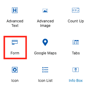
The Form block from Kadence WP allows you to not only create custom forms but style them however you want. With the Form block, you have the ability to add unlimited custom fields, and it also includes Google ReCaptcha support.
Add a new block to your page and select the Form Block to get started.
4. Settings and Styling
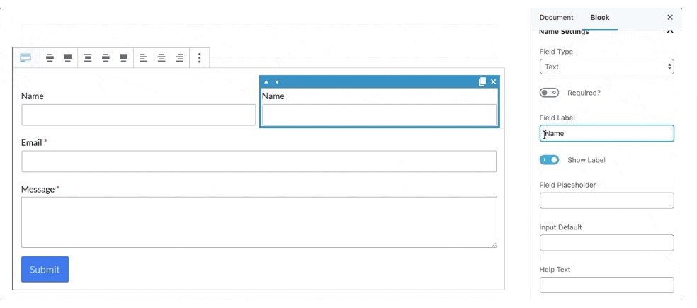
Create as many custom fields as you would like. You can duplicate rows, adjust the size of the columns, choose whether or not they are a required field, etc.
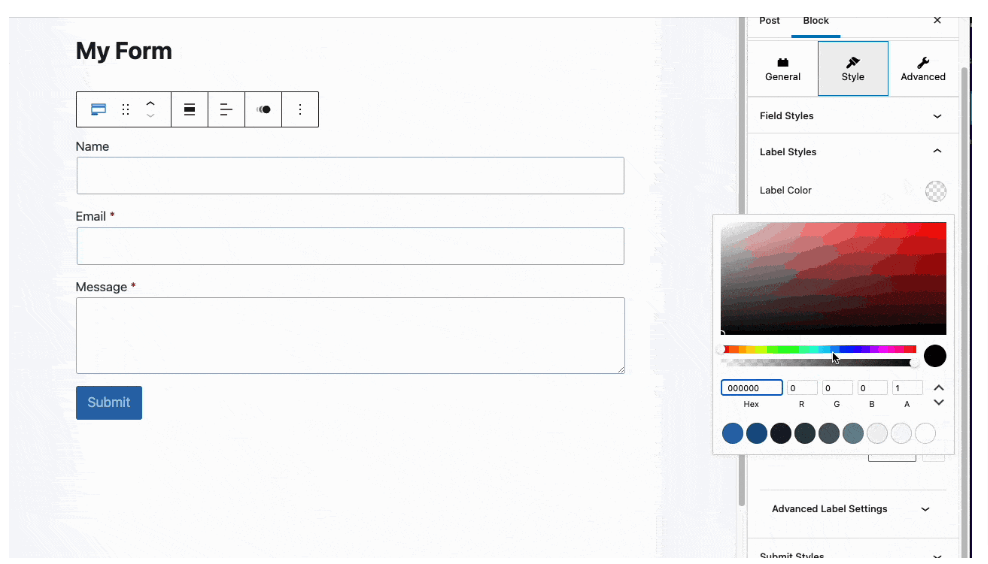
Adjust your field settings, including input background color, border settings, font styles, button settings, field row gap, and more!
5. Set up email forwarding
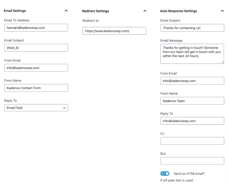
You can adjust your Actions After Submit settings within the Form Block settings. Choose if you want to receive an email after, whether or not you want the user redirected after submission, whether or not you want to incorporate an auto-response email, and choose if you want to set up a database entry. Check out Kadence Blocks Pro if you want MailChimp and SendInBlue integration, WebHooks calls, and new Database entries upon form submission.
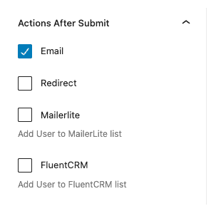
As each option is selected, you will see a tab that allows you to customize each action after submission.
6. Drop the contact form in your page
Our final step is to simply drop the contact form block into the page on which you’d like to use it. Remember, if you’re using a native Gutenberg editing plugin, you’ll have created a native item that you can essentially drag and drop wherever you want.
Though you’ll likely only need to have it in one place, this helps keep your WordPress site more modular.
How do I optimize a “contact us” page?
This is the area where it starts to get a tad dicey. In part, this is due to the fact that “optimization” can mean a billion different things. We’ll focus on the technical definition of the word as we address this question.
First, remember that speed is the name of the game, especially for visitors giving your WordPress blog a try for the first time. Once loading time goes past one second, visitor attrition rates start skyrocketing. Minify JavaScript files, ensure your site header is optimized, make images render using the least bandwidth possible, and take advantage of asynchronous loading to first get the most important bits of the page up there for slower connections. Using a Content Delivery Network (CDN) is also a great way to ensure that visitors are never too far from the server delivering your site.
Second, always get outside input on your contact forms. While we’re sure you can make a killer page, everyone usually has a slight oversight at minimum when creating a “Contact Us” page. Getting ideas from a diverse group of people is usually the best way to preemptively save your WordPress site from a less-than-ideally done page!
Third, make that page less confusing! So many contact pages have either conflicting information or too much contact information. For example, if you’re a web hosting company, chances are that visitors can live without seeing that Google Maps widget hogging half their bandwidth to show them exactly where your physical business is located.
7 contact page best practices
We’ve highlighted seven of the most important “best practices” when creating your new “Contact Us” form. While these are in an ordered list, the order is not indicative of importance or priority; it’s random.
1. Keep it simple
Get rid of any fields that don’t provide direct value or that aren’t of high importance. At a minimum, ensure that such fields are optional, especially if they pertain to information most people don’t want to share with the world, like a mobile phone number.
2. Give a reason
Provide a good rationale for why users need to contact you. Remember, using WordPress “Contact Us” forms isn’t a hobby for most people. Giving them a good reason, like a discount or other promise, shows you value your visitors’ time and engagement with your blog.
3. Have more than one way
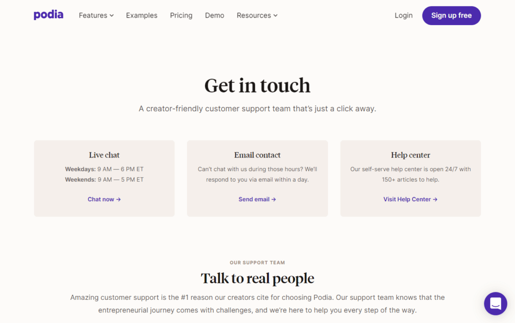
“There can be only one” should only be the cry of the Highlander. You want to have other contact mechanisms available in case either your form just isn’t available or isn’t working, or a visitor simply prefers to use another popular method of contact.
4. Make it easy
As the user enters and submits information, provide feedback to let the user know that things are working as they should. For example, all fields should be validated; if you request an email address, tell the user right away whether what they entered in your “email” field will suffice. As soon as the form is submitted, tell the user whether it was successful and, if so, how long they should expect to wait for a personal reply.
5. Automate when possible
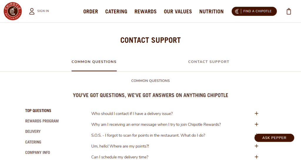
Explanations that make sense with your business and business model. For more tech-savvy businesses, this could take the form of a few FAQs tailored to the type of inquiry the user is sending through the form. For other businesses, perhaps it could simply be a link to your information and help library; this cuts down on unnecessary contacts. (You’ll notice the examples of how some companies combine FAQ pages with contact pages).
6. Make the most of the lead
Maximize conversion potential by showing visitors some of your top content once they submit the form. Again, something like a coupon for your store is a great idea, too. Anything that adds value to the experience rather than just an empty “Thanks for contacting us!” will likely keep new visitors returning to your WordPress site.
7. Make it human
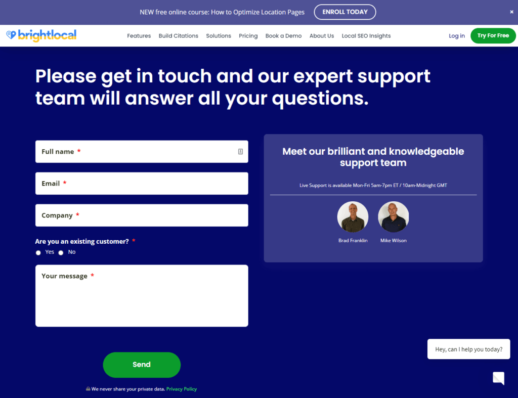
It is all about making connections that will grow up into relationships – because it is all about the relationships. Have a way to add faces to the usernames and names on your site. When people see exactly with whom they’re talking, they’re more likely to behave respectfully and see the person as a human, not just a robot.
Of course, this is just the tip of the iceberg when it comes to best practices for those “Contact Us” pages. Unfortunately, these pages are notorious in UX evaluation circles because of how much experts diverge in their opinions of how these should be run. You absolutely need to test drive a contact page before putting it out there to the general public!
When you connect with your visitors, you set a foundation for growing up your business’s success.
Get SolidWP tips direct in your inbox
Sign up
Get started with confidence — risk free, guaranteed
3 successful contact page examples
Let’s take a look at three particularly powerful contact forms and why they’re awesome!
1. Media Proper
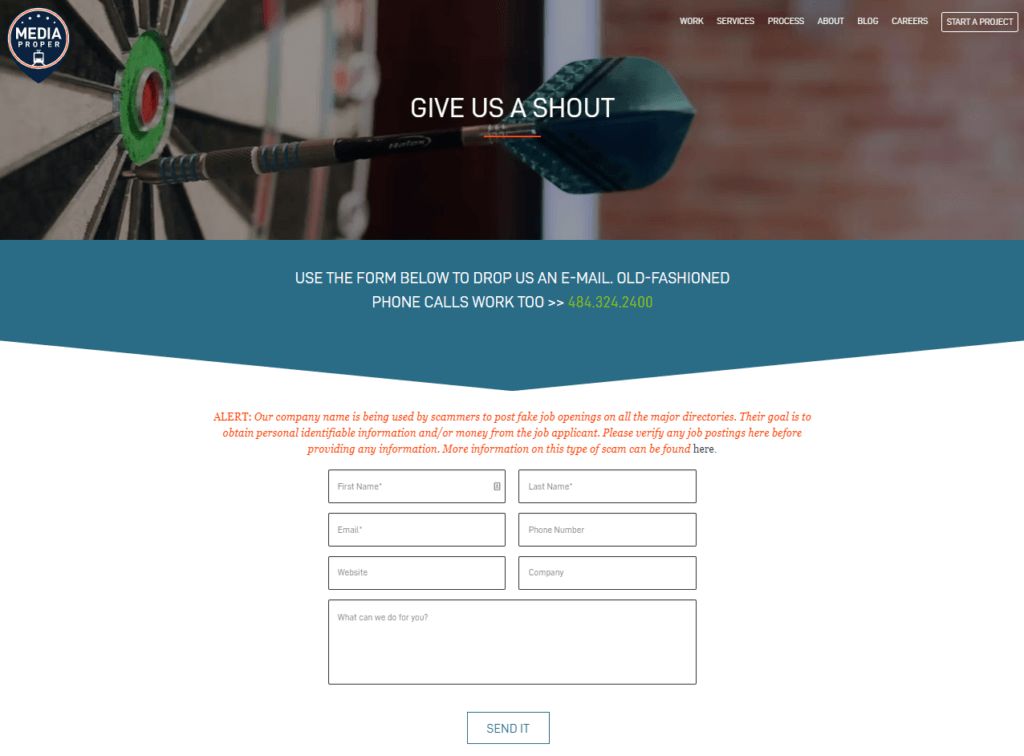
Media Proper offers a gem of a “Contact Us” page. As you can see, they stick to their brand quite well. The page begins with a pretty large statement saying that visitors are free to call them if they prefer to, offering them alternative contact options. It’s clear which fields are mandatory and which are simply preferred; there’s also instant validation before the form is submitted. Each field is very clearly defined, yet creative interpretive room is left for more artsy users.
2. PeopleMetrics
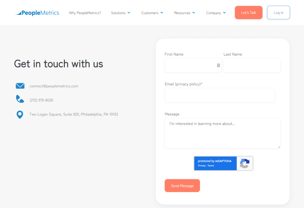
PeopleMetrics is a more fully-featured page designed to be a great example for brick-and-mortar businesses. First, it uses a lightweight Google Maps widget to show the location of the business without hogging bandwidth and computational resources for the client. Second, it includes all official contact information for the business, building trust. To further build trust, you can click to view their Privacy Policy when you enter your email. The form has very minimal fields, though they aren’t as categorized as we might have liked. Overall, it’s a straightforward page with little room left for error and maximum trust-building and contact options.
3. The Weifield Group
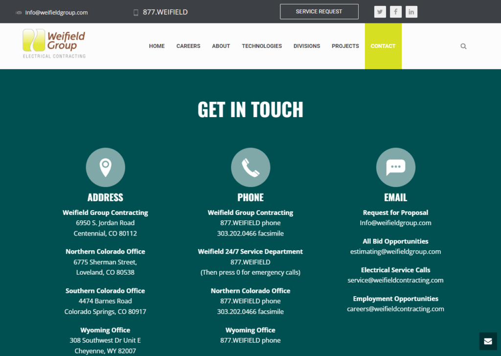
The Weifield Group contact page is the most fully-fledged form on our list. It first includes all relevant information for secondary contact methods to eliminate unnecessary contact form submissions. This is particularly important for multi-site businesses. It even has a disclaimer after you scroll down, indicating that those looking for employment should not fill out the form; informal filters like this will cut down on unnecessary submissions. The site utilizes asynchronous loading so that the browser can’t see elements that aren’t even rendered, saving maximum bandwidth and space. Finally, trust is built mutually by showing the client exactly where the business is.
Inspiration and ideas for contact page design
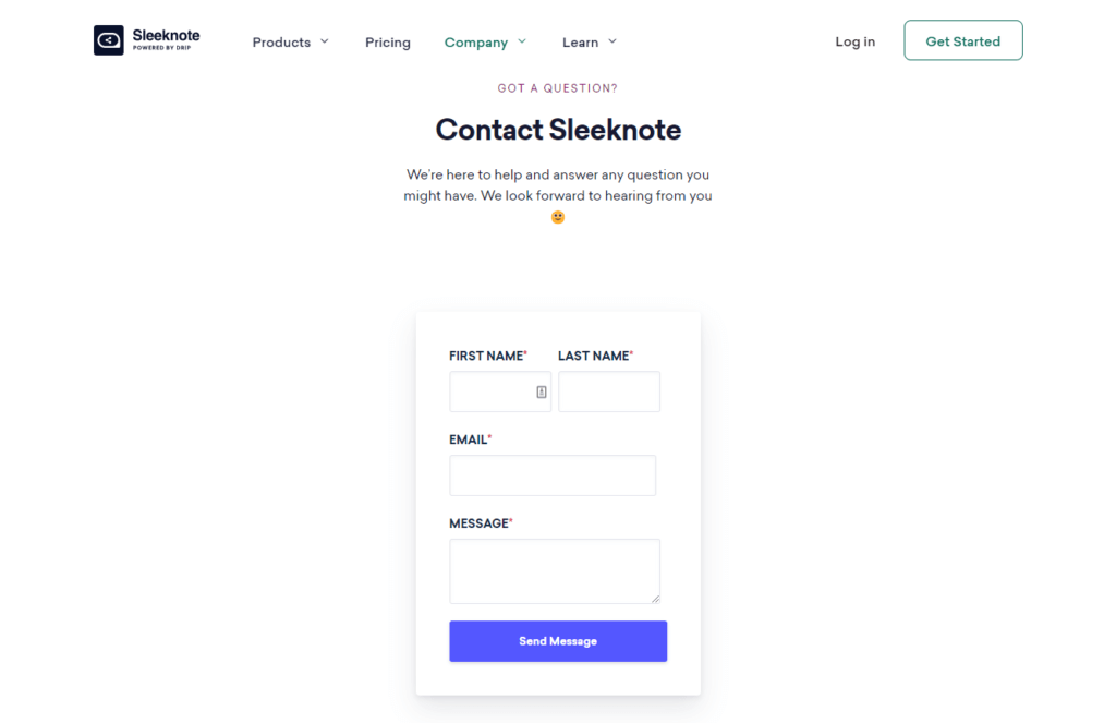
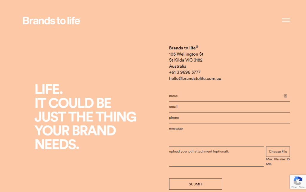
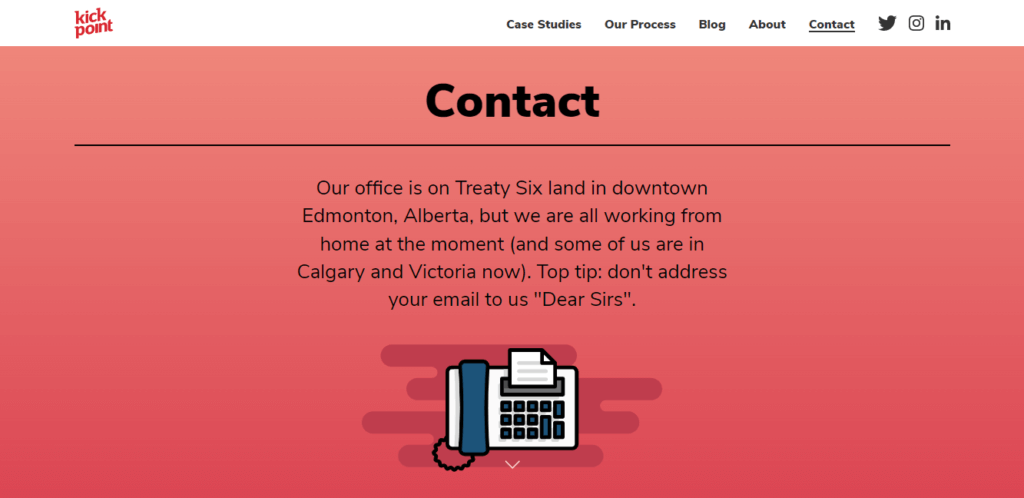
Before we go, we wanted to provide you with seven of our favorite great examples of contact forms. Unlike our above list, we won’t tell you why they’re great; we’re hoping that at this point, that will be self-evident! Again, this list is in no particular order of supremacy.

Wrapping up
We hope this has been an enjoyable and informative deep dive into how the best “Contact Us” forms are made. This may seem like a jumble of information right now and don’t feel pressured to memorize all of our best practices. Like any art, the best pages are simply made by trial and error after the initial skill is learned!

Download Kadence Theme & Kadence Blocks To Build An Effective Websites
If you love to create compelling content with beautiful design, Kadence Blocks provides tools to be creative right in the native WordPress editor. Plus, enjoy tons of prebuilt content you can easily include in your site, including a wireframe library of blocks to get your started on your next web design. Great for inspiration and fast development!
Sign up now — Get SolidWP updates and valuable content straight to your inbox
Sign up
Get started with confidence — risk free, guaranteed
